Challenge
Create an online destination that feels editorial and premium while keeping shopping pathways immediate on every screen.
Build the acquisition system
01Website design SydneyStrategy / UX / Development02Shopify + ecommerceStores / Migration / CRO03SEOTechnical / Content / Authority04BrandingStrategy / Identity / Launch05Website project plannerScope / Range / BriefWhere we work
Sydney ↗Melbourne ↗Brisbane ↗Perth ↗Sutherland Shire ↗High-intent guides
Website design cost ↗Shopify website cost ↗SEO cost guide ↗Proof + thinking
Selected work ↗Insights ↗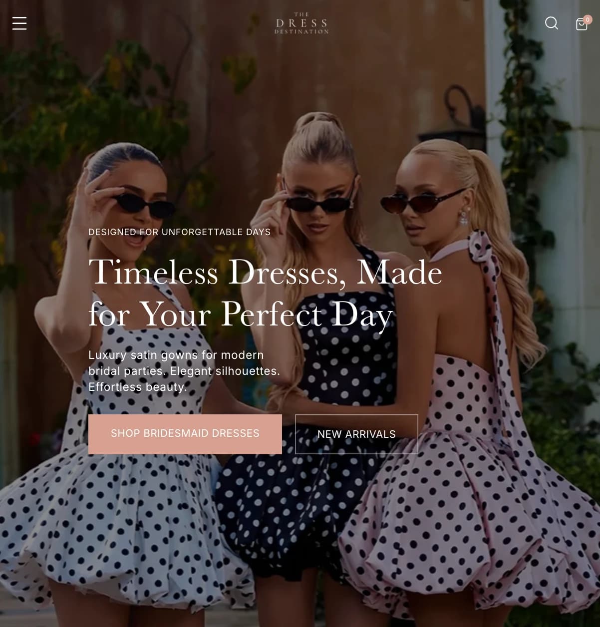 Featured projectThe Dress DestinationView case study ↗
Not sure which service fits?
Tell us what you need to improve.Start a conversationFashion ecommerce
Shopify homepage, navigation and catalogue improvements connecting fashion imagery with clear product discovery.

Case study answer
Simpli delivered Ecommerce strategy, UX/UI design, Creative direction to address this challenge: Create an online destination that feels editorial and premium while keeping shopping pathways immediate on every screen.
Create an online destination that feels editorial and premium while keeping shopping pathways immediate on every screen.
We built the visual hierarchy around decisive campaign imagery, restrained typography and direct category pathways. The same design logic compresses cleanly for mobile instead of becoming a reduced desktop layout.
A distinctive ecommerce direction with a clear brand world, shoppable storytelling and a mobile experience that keeps the product—and the next action—in focus.
Scope
Shopify homepage, navigation and catalogue improvements connecting fashion imagery with clear product discovery.
Discuss a similar challengeCreate an online destination that feels editorial and premium while keeping shopping pathways immediate on every screen.
We built the visual hierarchy around decisive campaign imagery, restrained typography and direct category pathways. The same design logic compresses cleanly for mobile instead of becoming a reduced desktop layout.
A distinctive ecommerce direction with a clear brand world, shoppable storytelling and a mobile experience that keeps the product—and the next action—in focus.
Delivery detail
The store needed a premium fashion presentation while keeping the catalogue, sizing and shopping pathways practical to maintain.
The work combined a refreshed desktop and mobile homepage, clearer menu pathways, updated imagery and catalogue maintenance. The design gives campaign photography a strong role while keeping collection browsing and product information accessible.
Reworked the presentation across desktop and mobile, with updated hero and collection imagery.
Restructured the menu to give shoppers clearer routes into the product range.
Reviewed placeholder and unverified records, corrected stock information and prepared product listings with images, sizing and inventory details.
Delivered a refreshed homepage, restructured navigation and catalogue updates across desktop and mobile. The project evidence demonstrates the implementation; sales uplift has not been attributed to these changes.
The published work demonstrates layout, navigation and catalogue decisions. Commercial evaluation should compare product discovery, buying actions and purchases over equivalent periods, with other campaigns and stock changes recorded alongside the release.


Design decisions
The experience uses campaign imagery to establish desire while preserving clear category, product and mobile shopping pathways.
High-impact imagery creates a recognisable fashion point of view before the catalogue takes over.
Category and purchase actions remain visible so editorial design does not create navigation friction.
The small-screen layout is composed around browsing and buying rather than treated as a compressed desktop page.